
Sales vs Orders
The second tab on the Alerts screen asks one question of every store: does what it orders through approved channels match what it sells?
A store that sells a lot of coffee has to be buying a lot of beans from somewhere. If the beans are not coming from you or from an authorized partner-supplier, they are coming from somewhere else — and this tab is where that shows up as a number you can compare across the network.
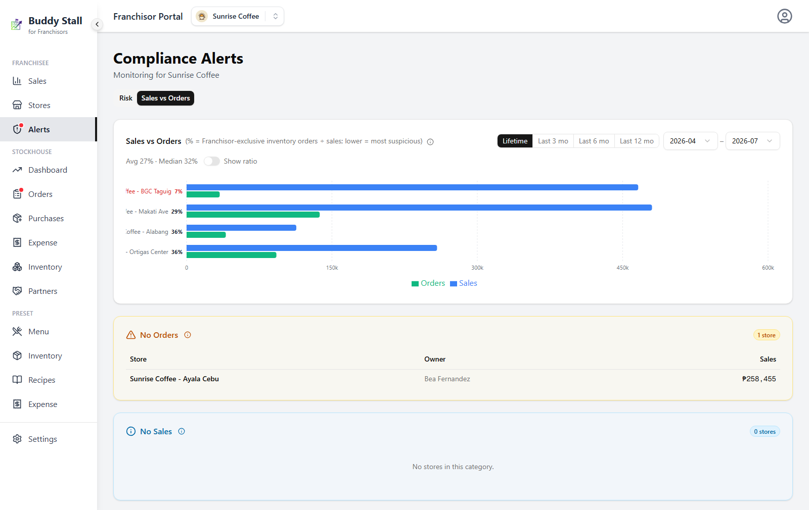
Everything on the tab is one screen: the chart ranks every store that has both sales and orders, and the two cards below it hold the stores the ratio cannot rank — No Orders (sales, nothing delivered) and No Sales (the ratio has no denominator).
What the percentage means
Beside every store name is a single figure: Orders ÷ Sales.
- Orders (the numerator) — your Franchisor-exclusive ingredients delivered to that store through either approved channel: direct Franchisor orders and authorized partner-supplier orders. Each line is valued at the quantity actually received × its unit price. Only exclusive items count; anything a store is free to source elsewhere is not part of the question.
- Sales (the denominator) — that store's franchise menu sales at list price, with combo items counted once, from the store's first delivery onward.
So a store showing 22% bought ingredients from approved channels worth 22% of what it rang up. The absolute number depends entirely on your margins — what matters is how one store compares with the rest of the network.
A store that has been open for months but only started ordering from you last week would otherwise show an absurdly low ratio. The denominator starts at the first delivery, so the two sides always cover the same stretch of time.
Reading the chart
Stores are sorted ascending by ratio, so the lowest — the ones worth asking about — sit at the top. The percentage sits beside each store name.
Two tones flag stores that are out of line with the rest of the network, measured against the median of the charted stores:
- Red — below a third of the median.
- Amber — below half of the median.
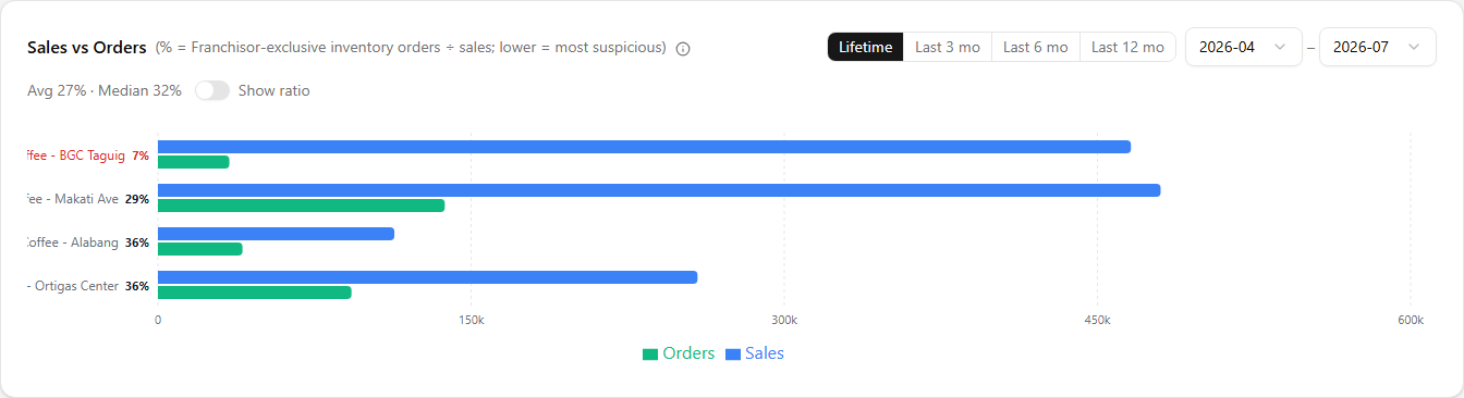
In the shot below, the store on top sits at 7% against a 32% median — below a third of it, so its percentage is red, and so is its bar once you switch to ratio mode. The other three run from 29% to 36%: it is that cluster which makes the one below it worth a question.
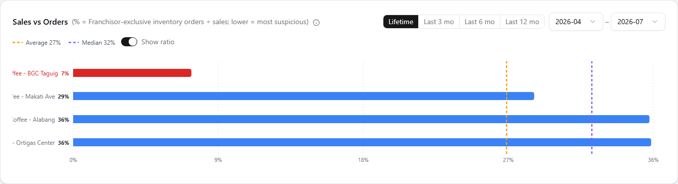
By default the chart plots the two amounts side by side — blue for sales, green for orders — which shows the size of the store as well as its ratio. Switch Show ratio on and it becomes a single percentage bar per store, with dashed reference lines for the network Average and Median. Use amounts to see who is big, ratio to see who is out of line.
Hover any bar for that store's sales, orders, its Orders ÷ Sales percentage, and days since first delivery — a young store's ratio is always the least reliable, and this is where you check that.
Choosing the period
The selector at the top-right of the chart card offers Lifetime, Last 3 mo, Last 6 mo and Last 12 mo, plus two month dropdowns for any custom range. It opens on Lifetime.
Everything on the tab — the chart, the averages, and which stores fall into the two sections below — is recalculated for the range you pick.
The coverage window
Orders arrive in lumps; sales happen every day. A store that took one big delivery in March and none in April would read as perfect in March and as a thief in April — for the same steady behaviour.
To fix that, each order is spread evenly forward over a coverage window, and only the part that overlaps the period you are looking at is counted.
With a two-month window, a ₱60,000 delivery is treated as ₱30,000 of supply in its own month and ₱30,000 in the next. Look at March to May and only the second half of that February order falls inside, so ₱30,000 of it counts — the April order sits inside the range completely, so all ₱40,000 of it does.
The window length is set automatically per franchise, from how often stores here actually take deliveries, and it is shown in the tab's info popover (Coverage window (2 mo)). It does not change when you change the period, so the figures stay comparable as you move the range around.
No Orders
Stores with franchise sales but no delivered Franchisor or partner-supplier orders attributable to the period. Their ratio is effectively 0%, so they are pulled out of the chart into their own amber card, listed with the sales they made anyway.
This is the most suspicious end of the tab. A store selling your menu with nothing arriving from an approved channel is sourcing its ingredients somewhere — the only innocent explanations are a store that stocked up before the period, or one whose deliveries have not been recorded.

No Sales
No franchise sales in the period, so the ratio cannot be computed at all. These stores are listed separately, in blue, with the orders they took — which is often the interesting part: a store receiving deliveries while recording no sales is worth a call for a different reason.
Closed stores, new stores that have not opened yet, and stores whose POS is not being used all land here.

Following up on a low ratio
A low percentage is a question, not a finding. Before raising it:
- Check the period. Widen it to Lifetime. A store that ordered heavily just before your window opens looks starved inside it.
- Check the age. Days since first delivery in the tooltip — a store two weeks into trading has too little history to compare.
- Cross-check the Risk board. A low ratio next to negative stock or a correction pattern on the same owner is a much stronger story than either signal alone.
- Check the partner-supplier side. Orders through an authorized partner-supplier already count here. A partner whose deliveries are not being recorded will drag every store it serves downward at once — if a whole group of stores drops together, suspect the channel, not the stores.